Thursday, 28 February 2013

CONSTRUCTION- Album Cover

After finishing the the front cover i decided that for the backcover I would like to keep the dripping effect and the colourful background, as it is energetic and loud, which suits the band.
Backcover background- painted by watercolour
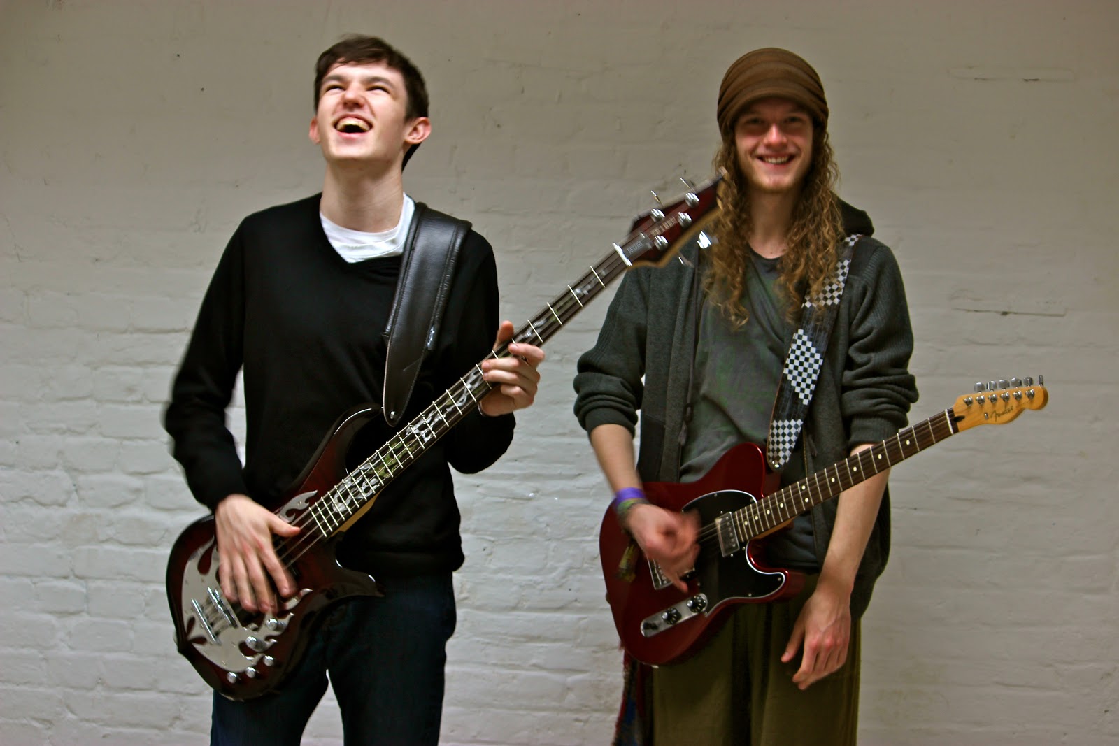
 Here is one of the photographs that I took for the band and I decided to put this on the back cover. It shows two of the members having fun and laughing, which seems really generic.

Sunday, 24 February 2013

CONSTRUCTION- NARRATIVE

Since the narrative in our music video isnt complete and some footage was badly lit, we decided to redo it. So we went to Esher train station and I filmed the lead singer and two of his friends driving to the train station, walking towards the platform, getting on a train and going on a holiday.


Tuesday, 19 February 2013

CONSTRUCTION- Album Cover

Here are two different versions of album front cover I designed for our project. I have altered the design from the original draft as my groupmate and I both agreed that showing the faces of the band members and having them filling up the whole cover would suit the band more, as it is energetic, loud and bold.
The difference between these two covers are that the first one has a watermark effect, which seems more artistic and alternative; and the second one has a smaller band logo but the band members are on the foreground, which is loud and clear.
I like both of them as they both carry different messages and create different effects. Therefore, we are going to show these to our target audience when we have finished the back cover and get some feedback.



Wednesday, 13 February 2013

CONSTRUCTION- Album Cover Photoshoot

In order to create my album cover and magazine advert, I did a Photoshoot of the band and here are some of the photos.
I really like them because they look casual. yet show that the band is like a group of close young friends, which suits the band image created in the music video.


Sunday, 10 February 2013

CONSTRUCTION- LOGO FOR THE SONG & THE BAND

Today, I created the logo of the song and the band name for our project, this is based on the initial design I did last month. I edited it on Photoshop and by filling in colours and enhancing the shades to make it look more professional. I really like this logo because it is bright, vibrant, loud and energetic which suits the song and the band image.
INITIAL DESIGN

COMPLETED LOGO

Thursday, 7 February 2013

RESEARCH- MUSIC SALES

iTunes article in Metro 06.02.13

  • Music lovers have downloaded a record 25 billion songs from the Apple iTunes Store, the Cupertino-based company has announced.
  • More than 15,000 songs are downloaded per minute across the world.
  • Available in 119 countries, the iTunes Store is the world’s most popular music store with a catalogue of over 26 million songs.

CONSTRUCTION- Album Cover

BACKGROUND OF ALBUM COVER
In today's lesson, I went to the art department and worked on our album cover. In order to create a watery, colourful and energetic effect, I used acrylic paint and adopted the 'wet on wet' method to create the background of the front cover. I really like the outcome because it is eye catchy and the colours blend in really well. I also like the dripping effect because it shows movement, and the flow of water and paint. I will then work on the other sides of the digipack based on this theme.