My foundation project was a psychological thriller based on the story of the emotional turmoil of a teenage boy and flashbacks were carefully placed in the opening to revel his haunting/distressing past, that involved the hospitalisation and possibly death of his girlfriend.
According to Roland Barthes' theory, hermeneutic code creates enigma within its narrative. Mysterious clues have been used in our film opening to connote emotions and possible reasons for the characters depression, for example : screaming of the girl to show possible danger and trauma; the contrast between the bright , high-key lighting of the flashback scenes and the dullness and gloominess of the normal scene, showing a change of event; and the last scene of George running towards the edge of the roof. However, none of these actions are explained throughout the opening, and only part of the story is showed to audiences, suspense is thus created and gets the audiences guessing as to what will happen next.
Our narrative framework is heavily based on sound code to create meaning. The music of the sequence started of slow and eerie, creating a negative and mysterious mood in the audiences' mindset, therefore creates a sense of uneasiness and suspense.
The symbolic code in our sequence creates a dark mood, which creates suspense and is often associated with death and evil. The main character, George appears to to depressed as he appears to be unkempt and rough, and his dark clothing in the last suicidal scene further suggests that he might have troubled and dark thoughts, which leaves audiences to wonder what the ending would be and what has caused such a dramatic change of event.
We incorporated footages of dove, as it is often used as a symbol of love and happiness, however it also conveys an opposite idea
Saturday, 2 February 2013
Friday, 1 February 2013
Wednesday, 23 January 2013
CONSTRUCTION- Stop Motion
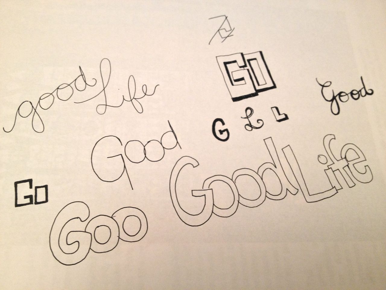
We decided to use stop motion in our chorus of our music video to add a sense of diversity and vibrancy. Since the lyrics of the chorus is "Good Life, Good Good Life", we desire to use this. We took pictures of the lead singer and letters of 'Good Life' and edited them using Photoshop.


 |
| Edited images |
 |
| Screenshot- Photoshop |
Saturday, 19 January 2013
CONSTRUCTION- colour correction

Tuesday, 15 January 2013
PRODUCTION: filming and colour correction

 |
| Filming at school |
Saturday, 12 January 2013
PLANNING: DIGIPACK DESIGN
One Republic's digipack design reflects their music promo in its upbeat quality: these colours are vibrant, bold & bright, like the outdoor band performance in the video with strong bright colours
One Republic's Waking Up album cover - One Republic's album design for 'Waking Up' has a dynamic quality to reflect its meaning, with a fizzing upward movement resembling balloons, fireworks or fountains
- One Republic's album design is above all FUN, like the music video's contents where the band members are all larking about having fun together, rather than a formal performance where they take it too seriously
 |
| Digipack design |
- Our digipack is made out of three main elements: Colourful splashes of colour in the background, the band having fun, moving around in the foreground and bold, comic-like text to show the name of the cover and the band name
- The background of our digipack echos One Republic's Waking Up album, as we want to reflect the same band characteristics of vibrant, bold and bright, like the strong, golden colour of the outdoor band performance in our music video.
- The profile of the band in the foreground shows how the band loves having fun with each other, and it also shows motion and movement, which reinforces their free and strong spirit.
- The text of the title echos designs of teens t-shirts and hoodies, and the idea is to show that the main audiences of our album is teenagers and young adults, and shows the energy shared between audiences and the band
Wednesday, 9 January 2013
PLANNING- Album Cover
 |
| After looking at fonts we like on T-shirts form different brands, I came up with some designs for our album cover. I especially like the ones with big and bold strokes because they create a young and energetic feeling which suit our brand. I will continue to look at different fonts and designs for our music album cover. |
Subscribe to:
Posts (Atom)