Wednesday 23 January 2013

CONSTRUCTION- Stop Motion

We decided to use stop motion in our chorus of our music video to add a sense of diversity and vibrancy. Since the lyrics of the chorus is "Good Life, Good Good Life", we desire to use this. We took pictures of the lead singer and letters of 'Good Life' and edited them using Photoshop.


Edited images
Screenshot- Photoshop

Saturday 19 January 2013

CONSTRUCTION- colour correction

After filming the footage of Piers (the lead singer) singing at the Belvedere, I used Adobe Premiere to do some colour corrections during today's lesson. By adjusting the RGB curve, brightness and contrast, and the exposure, the colour of footage is now more vibrant and rich, which suits the theme and mood of our band and out project. 

Tuesday 15 January 2013

PRODUCTION: filming and colour correction


Filming at school
In today's lesson, Piers and I went to The Belvedere at school for the solo performance in our music video. The location suits our idea because its open with beautiful trees and bushes that match with the band performance, which shows continuity and consistency.

Saturday 12 January 2013

PLANNING: DIGIPACK DESIGN

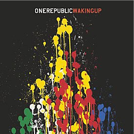
  • One Republic's Waking Up album cover
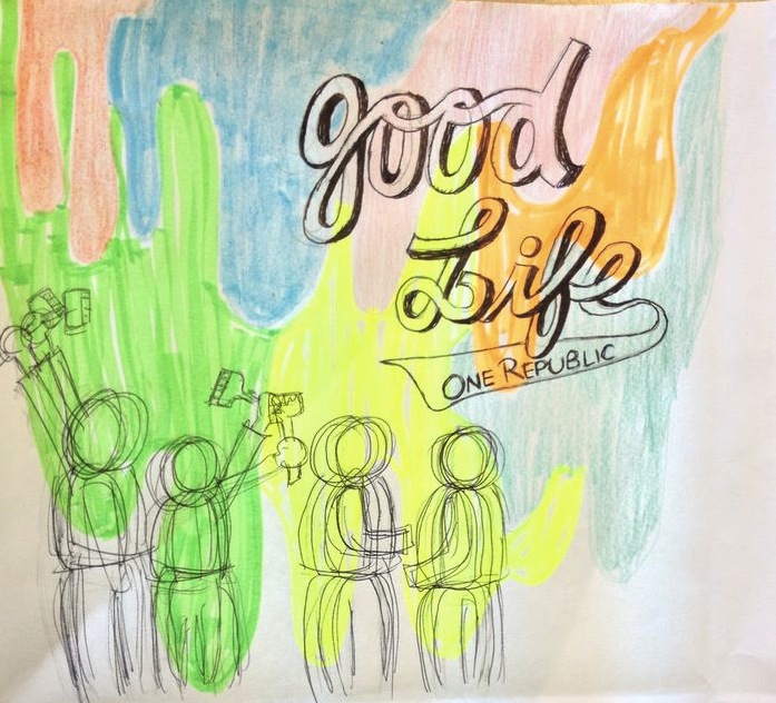
    One Republic's digipack design reflects their music promo in its upbeat quality: these colours are vibrant, bold & bright, like the outdoor band performance in the video with strong bright colours
  • One Republic's album design for 'Waking Up' has a dynamic quality to reflect its meaning, with a fizzing upward movement resembling balloons, fireworks or fountains
  • One Republic's album design is above all FUN, like the music video's contents where the band members are all larking about having fun together, rather than a formal performance where they take it too seriously


Digipack design
  • Our digipack is made out of three main elements: Colourful splashes of colour in the background, the band having fun, moving around in the foreground and bold, comic-like text to show the name of the cover and the band name
  • The background of our digipack echos One Republic's Waking Up album, as we want to reflect the same band characteristics of vibrant, bold and bright, like the strong, golden colour of the outdoor band performance in our music video.
  • The profile of the band in the foreground shows how the band loves having fun with each other, and it also shows motion and movement, which reinforces their free and strong spirit.
  • The text of the title echos designs of teens t-shirts and hoodies, and the idea is to show that the main audiences of our album is teenagers and young adults, and shows the energy shared between audiences and the band 

Wednesday 9 January 2013

PLANNING- Album Cover

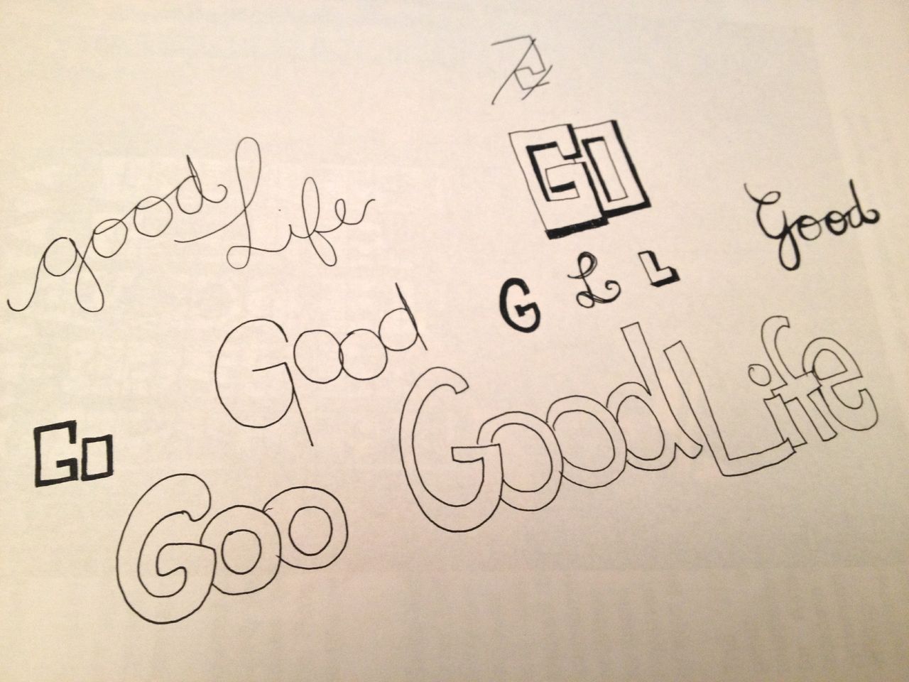
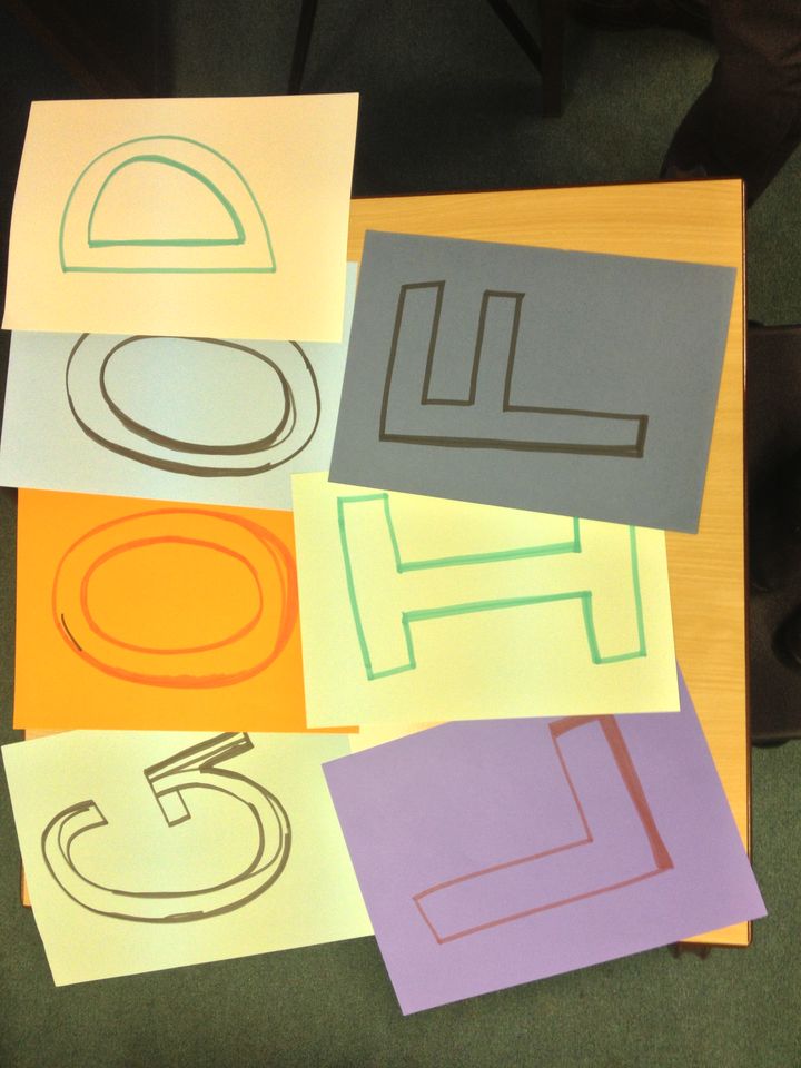
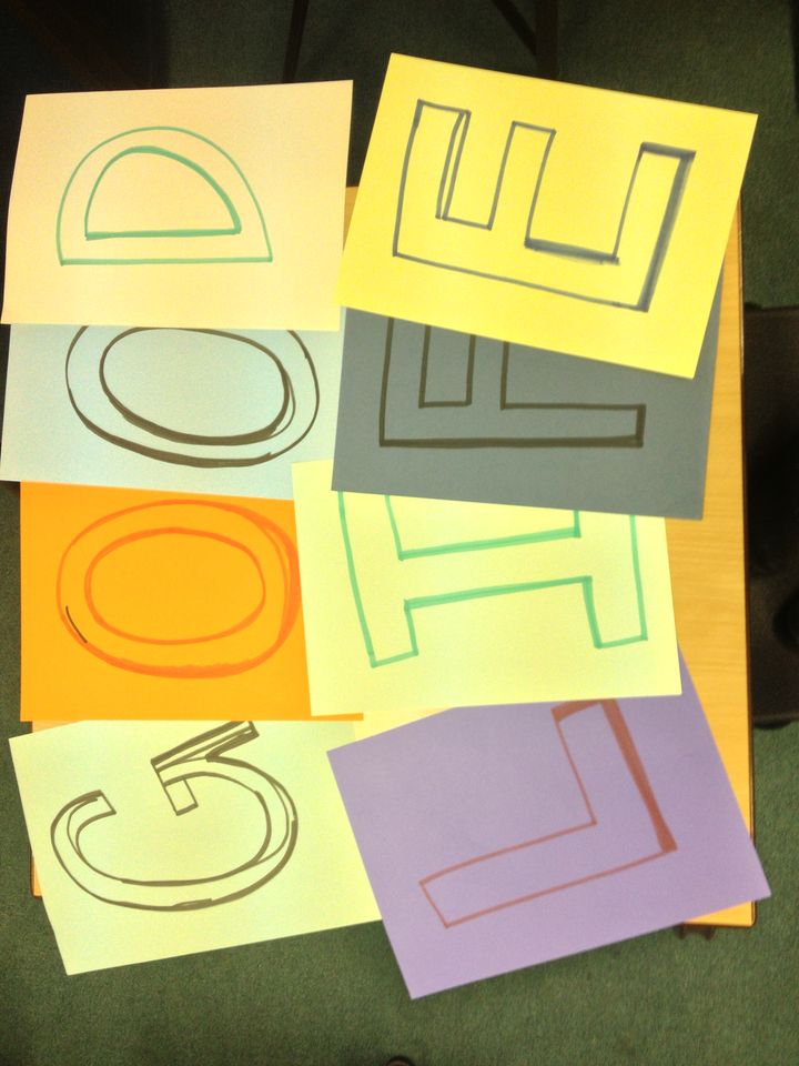
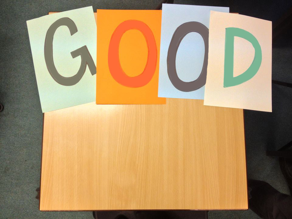
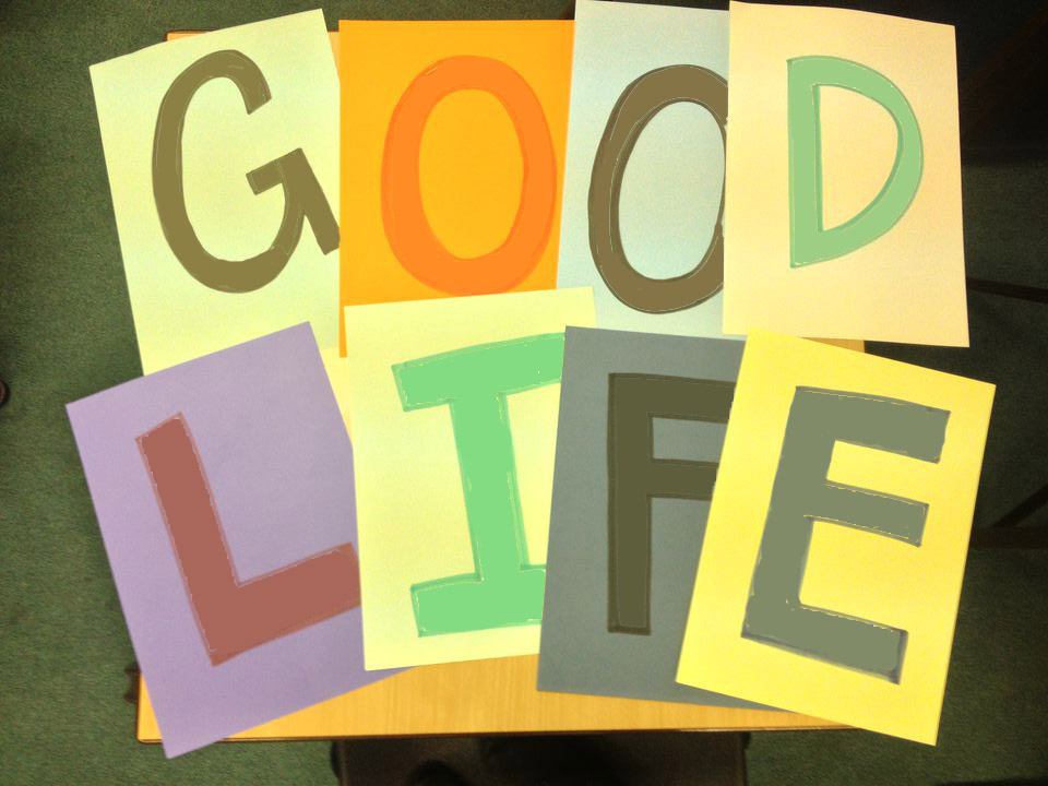
After looking at fonts we like on T-shirts form different brands, I came up with some designs for our album cover. I especially like the ones with big and bold strokes because they create a young and energetic feeling which suit our brand.
I will continue to look at different fonts and designs for our music album cover.