Sunday 28 April 2013

Hello Examiner

Welcome to my A2 Media Studies Blog. The below posts contain: My music promotional video, magazine advert and the album artwork (digipak). The posts below will visually show my thought processes as the product developed from the initial idea, to final products. My evaluation questions are on 4 separate pageswhich can be easily seen at the top of my Blog.


Hiu Ki Tsang 1088
OCR A2 Media Studies
April 2013
Video Brief:
To create a music video along with its ancillary products.

Finished product- Music Video

Sunday 24 March 2013

CONSTRUCTION- DISC DESIGN

This will be the background of our disc design. I created this using watercolour because the colours blend in with each other really well, but with a dry-on-dry technique, some colours stand out from other colours which I really like. This creates an 'explosion of colours' effect, which is energetic, young and optimistic, which suit the band image.

Wednesday 20 March 2013

CONSTRUCTION- Tracking (Green screen)

We chose to track and insert some of our band performance footage onto a piece of footage where two friends are apparently watching our music video. This will provide an illusion that the friends are watching the video together. The phone also is related to the lyrics where it is placed 'pictures on my phone'.


Saturday 2 March 2013

CONSTRUCTION- ALBUM COVER Back Cover

Here is the back cover I designed for my project I used the watermark effect again, which I really like because it is bright and colourful, which suits the message of "Good Life". 
I also added a bar code, the producers' logos and the FBI anti-piracy logo to make the cover more realistic and professional. 


Thursday 28 February 2013

CONSTRUCTION- Album Cover

After finishing the the front cover i decided that for the backcover I would like to keep the dripping effect and the colourful background, as it is energetic and loud, which suits the band.
Backcover background- painted by watercolour
 Here is one of the photographs that I took for the band and I decided to put this on the back cover. It shows two of the members having fun and laughing, which seems really generic.

Sunday 24 February 2013

CONSTRUCTION- NARRATIVE

Since the narrative in our music video isnt complete and some footage was badly lit, we decided to redo it. So we went to Esher train station and I filmed the lead singer and two of his friends driving to the train station, walking towards the platform, getting on a train and going on a holiday.


Tuesday 19 February 2013

CONSTRUCTION- Album Cover

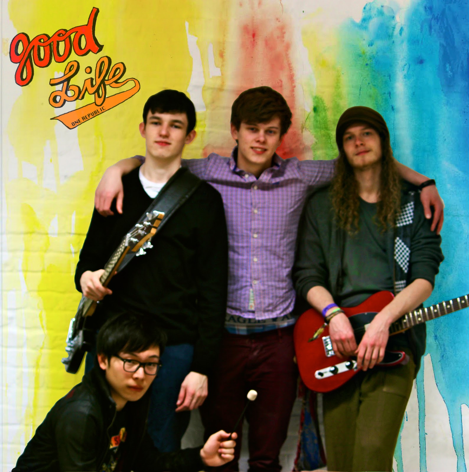
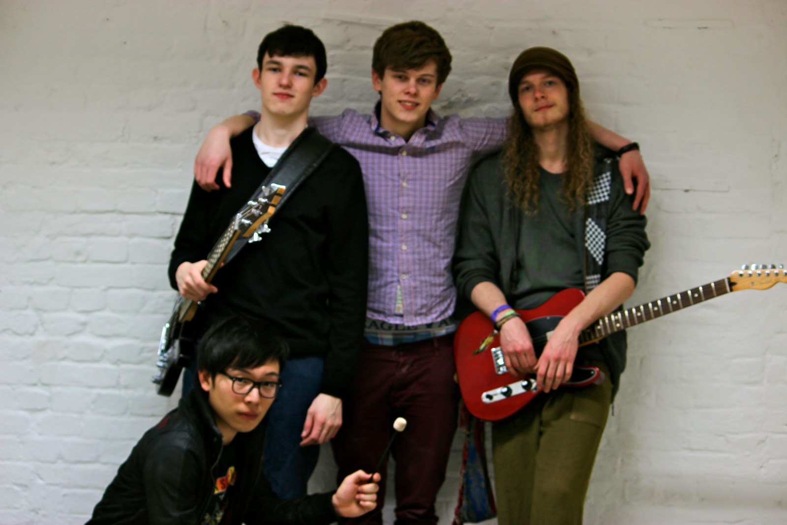
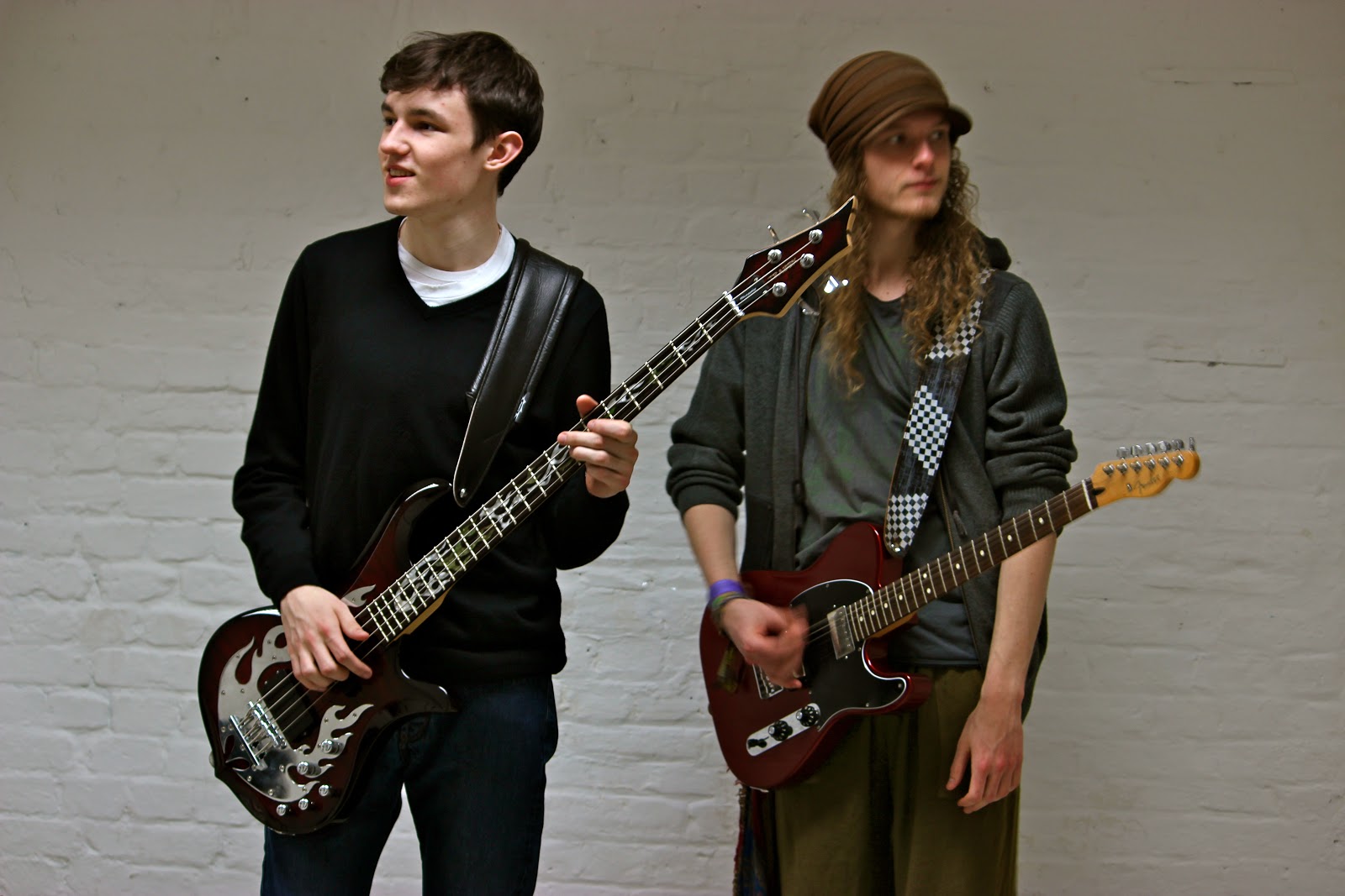
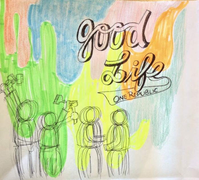
Here are two different versions of album front cover I designed for our project. I have altered the design from the original draft as my groupmate and I both agreed that showing the faces of the band members and having them filling up the whole cover would suit the band more, as it is energetic, loud and bold.
The difference between these two covers are that the first one has a watermark effect, which seems more artistic and alternative; and the second one has a smaller band logo but the band members are on the foreground, which is loud and clear.
I like both of them as they both carry different messages and create different effects. Therefore, we are going to show these to our target audience when we have finished the back cover and get some feedback.


Wednesday 13 February 2013

CONSTRUCTION- Album Cover Photoshoot

In order to create my album cover and magazine advert, I did a Photoshoot of the band and here are some of the photos.
I really like them because they look casual. yet show that the band is like a group of close young friends, which suits the band image created in the music video.


Sunday 10 February 2013

CONSTRUCTION- LOGO FOR THE SONG & THE BAND

Today, I created the logo of the song and the band name for our project, this is based on the initial design I did last month. I edited it on Photoshop and by filling in colours and enhancing the shades to make it look more professional. I really like this logo because it is bright, vibrant, loud and energetic which suits the song and the band image.
INITIAL DESIGN

COMPLETED LOGO

Thursday 7 February 2013

RESEARCH- MUSIC SALES

iTunes article in Metro 06.02.13

  • Music lovers have downloaded a record 25 billion songs from the Apple iTunes Store, the Cupertino-based company has announced.
  • More than 15,000 songs are downloaded per minute across the world.
  • Available in 119 countries, the iTunes Store is the world’s most popular music store with a catalogue of over 26 million songs.

CONSTRUCTION- Album Cover

BACKGROUND OF ALBUM COVER
In today's lesson, I went to the art department and worked on our album cover. In order to create a watery, colourful and energetic effect, I used acrylic paint and adopted the 'wet on wet' method to create the background of the front cover. I really like the outcome because it is eye catchy and the colours blend in really well. I also like the dripping effect because it shows movement, and the flow of water and paint. I will then work on the other sides of the digipack based on this theme.

Wednesday 6 February 2013

CONSTRUCTION- FILMING close up shots and band performance

In order to prepare for tomorrow's filming, I have done a sheet of camera shots and angles I am planning to film to make sure we will be able to get everything done smoothly and efficiently.I have purposely chosen to use close up shots of myself whistling to try to entice the consumer when they watch my music video to do the same and whistle along with the song. This will therefore help to make the song more intereactive and furthers the energetic mood I wish to construct through my video.
These will go into the band performance scenes.


Saturday 2 February 2013

Narrative of As thriller opening

My foundation project was a psychological thriller based on the story of the emotional turmoil of a teenage boy and flashbacks were carefully placed in the opening to revel his haunting/distressing past, that involved the hospitalisation and possibly death of his girlfriend.

According to Roland Barthes' theory, hermeneutic code creates enigma within its narrative.  Mysterious clues have been used in our film opening to connote emotions and possible reasons for the characters depression, for example : screaming of the girl to show possible danger and trauma; the contrast between the bright , high-key lighting of the flashback scenes and the dullness and gloominess of the normal scene, showing a change of event; and the last scene of George running towards the edge of the roof. However, none of these actions are explained throughout the opening, and only part of the story is showed to audiences, suspense is thus created and gets the audiences guessing as to what will happen next. 

Our narrative framework is heavily based on sound code to create meaning. The music of the sequence started of slow and eerie, creating a negative and mysterious mood in the audiences' mindset, therefore creates a sense of uneasiness and suspense.  

The symbolic code in our sequence creates a dark mood, which creates suspense and is often associated with death and evil. The main character, George appears to to depressed as he appears to be unkempt and rough, and his dark clothing in the last suicidal scene further suggests that he might have troubled and dark thoughts, which leaves audiences to wonder what the ending would be and what has caused such a dramatic change of event. 
We incorporated footages of dove, as it is often used as a symbol of love and happiness, however it also conveys an opposite idea 

Friday 1 February 2013

Wednesday 23 January 2013

CONSTRUCTION- Stop Motion

We decided to use stop motion in our chorus of our music video to add a sense of diversity and vibrancy. Since the lyrics of the chorus is "Good Life, Good Good Life", we desire to use this. We took pictures of the lead singer and letters of 'Good Life' and edited them using Photoshop.


Edited images
Screenshot- Photoshop

Saturday 19 January 2013

CONSTRUCTION- colour correction

After filming the footage of Piers (the lead singer) singing at the Belvedere, I used Adobe Premiere to do some colour corrections during today's lesson. By adjusting the RGB curve, brightness and contrast, and the exposure, the colour of footage is now more vibrant and rich, which suits the theme and mood of our band and out project. 

Tuesday 15 January 2013

PRODUCTION: filming and colour correction


Filming at school
In today's lesson, Piers and I went to The Belvedere at school for the solo performance in our music video. The location suits our idea because its open with beautiful trees and bushes that match with the band performance, which shows continuity and consistency.

Saturday 12 January 2013

PLANNING: DIGIPACK DESIGN

  • One Republic's Waking Up album cover
    One Republic's digipack design reflects their music promo in its upbeat quality: these colours are vibrant, bold & bright, like the outdoor band performance in the video with strong bright colours
  • One Republic's album design for 'Waking Up' has a dynamic quality to reflect its meaning, with a fizzing upward movement resembling balloons, fireworks or fountains
  • One Republic's album design is above all FUN, like the music video's contents where the band members are all larking about having fun together, rather than a formal performance where they take it too seriously


Digipack design
  • Our digipack is made out of three main elements: Colourful splashes of colour in the background, the band having fun, moving around in the foreground and bold, comic-like text to show the name of the cover and the band name
  • The background of our digipack echos One Republic's Waking Up album, as we want to reflect the same band characteristics of vibrant, bold and bright, like the strong, golden colour of the outdoor band performance in our music video.
  • The profile of the band in the foreground shows how the band loves having fun with each other, and it also shows motion and movement, which reinforces their free and strong spirit.
  • The text of the title echos designs of teens t-shirts and hoodies, and the idea is to show that the main audiences of our album is teenagers and young adults, and shows the energy shared between audiences and the band 

Wednesday 9 January 2013

PLANNING- Album Cover

After looking at fonts we like on T-shirts form different brands, I came up with some designs for our album cover. I especially like the ones with big and bold strokes because they create a young and energetic feeling which suit our brand.
I will continue to look at different fonts and designs for our music album cover.